When an idea is complex, showing it can be more powerful than simply explaining it.
Alex Hormozi is known for turning offers, pricing models, customer acquisition strategies, and business concepts into direct, easy-to-follow explanations.
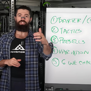
He often uses handwritten words, numbers, arrows, and simple diagrams to make abstract ideas visible.
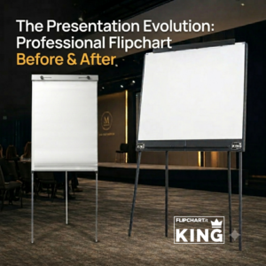
In some of his business and educational content, Alex Hormozi can be seen using a KING Flipchart: a professional, double-wide flipchart designed for entrepreneurs, marketers, consultants, coaches, speakers, and educators who need more visual space than a conventional easel pad can provide.
The board alone does not make a presentation effective.
The real impact comes from combining three elements:
- a clear, simplified idea;
- a visual framework built in real time;
- a large, stable writing surface that the audience can actually read.
This approach offers valuable lessons for anyone who teaches, sells, presents an offer, records educational content, leads a workshop, or explains a business strategy.
Why Alex Hormozi Uses KING Flipchart to Explain Business Concepts
A presentation slide usually shows a finished idea.
The audience sees the headline, supporting text, graphics, numbers, and conclusion all at once.
They must decide what to read while continuing to listen to the presenter.
A flipchart creates a different experience.
The visual appears in the same sequence as the explanation:
- the problem is introduced;
- the key elements are written down;
- the relationships are drawn;
- the numbers or examples are added;
- the conclusion becomes visible.
The audience does not simply receive the final answer.
It follows the construction of the idea.
This is particularly effective when explaining:
- an offer;
- a sales funnel;
- a customer acquisition process;
- a pricing strategy;
- unit economics;
- a value equation;
- a step-by-step framework;
- the relationship between several business variables.
The flipchart becomes a visual map that grows alongside the presentation.
Alex Hormozi and KING Flipchart: Turning Abstract Ideas Into Visual Frameworks
Concepts such as value, margin, conversion, lead generation, retention, positioning, and customer lifetime value can remain abstract until they are represented visually.
A single arrow can show direction.
Two columns can clarify a comparison.
A rising line can illustrate growth.
Three connected boxes can explain a process.
You do not need to be an artist to communicate visually.
An effective business explanation can be built with a few simple elements:
- keywords;
- numbers;
- arrows;
- circles;
- boxes;
- lines;
- basic charts;
- one or two accent colors.
The goal is not to create a perfect illustration.
The goal is to make the structure of the idea immediately understandable.
For marketers, this is especially useful when presenting concepts such as:
- traffic, leads, and customers;
- acquisition cost versus customer value;
- problem, mechanism, and solution;
- before-and-after positioning;
- front-end and back-end offers;
- awareness, consideration, and conversion;
- offer components and bonuses.
Build the Framework While You Explain It
One of the most common presentation mistakes is preparing a board that is already filled in.
That removes one of the strongest advantages of live visual communication: progression.
When the diagram is built during the explanation, the audience focuses on one element at a time.
A practical sequence is:
- introduce the idea verbally;
- write one keyword;
- explain what it means;
- add the next connection;
- pause and show the complete relationship.
The presenter controls the pace at which information appears.
The writing should not duplicate every word being spoken.
The voice provides context, examples, and meaning.
The board preserves the structure.
This is one reason handwritten frameworks can feel more engaging than predesigned slides.
The audience sees the thinking process unfold in real time.
Why the Panoramic KING Flipchart Surface Changes the Presentation
When fully opened, the KING Flipchart stands approximately 70 inches tall.
Its panel is approximately:
- 47.2 inches wide;
- 39.4 inches high.
The dedicated paper measures approximately:
- 44.9 inches wide;
- 34.2 inches high.
This gives the presenter a large, landscape-oriented visual area for developing ideas horizontally instead of compressing everything into a narrow vertical column.
A traditional flipchart may work well for a short list or a few notes.
It becomes more restrictive when the presenter needs to show:
- a complete funnel;
- a multistep process;
- a side-by-side comparison;
- a business formula;
- a customer journey;
- a timeline;
- a large chart;
- a framework with several connected elements.
The advantage is not simply having more square inches of paper.
The real advantage is being able to keep related concepts visible at the same time.
Instead of splitting one explanation across several pages, the presenter can show the complete logic of the idea on a single visual field.
How to Organize a Business Framework on KING Flipchart
A large writing surface should not be filled randomly.
One of the simplest ways to organize the board is to divide it into three logical areas.
Left Side: The Starting Point
Use the left side for:
- the customer’s current situation;
- the problem;
- the starting numbers;
- the old method;
- the limiting belief;
- the existing offer.
Center: The Mechanism or Process
Use the center for:
- the steps;
- the framework;
- the strategy;
- the value equation;
- the marketing mechanism;
- the transformation process;
- the relationship between variables.
Right Side: The Outcome
Use the right side for:
- the result;
- the improved offer;
- the new business model;
- the decision;
- the transformation;
- the next action;
- the call to action.
This left-to-right structure works particularly well for marketers because it mirrors many familiar formats:
- problem → mechanism → solution;
- before → process → after;
- traffic → conversion → revenue;
- current offer → improvements → stronger offer;
- cost → value creation → return.
The board does not need to be completely filled.
White space separates ideas, establishes hierarchy, and makes the framework easier to understand.
How to Write Clearly on KING Flipchart
Writing that looks readable from three feet away may become almost invisible from the back of a room or on a smartphone screen.
That is why stroke size matters.
The KING Magnum Markers use an oversized chisel tip that produces a stroke between approximately 6 and 12 millimeters.
The wide edge can be used for:
- headlines;
- key words;
- major numbers;
- offer names;
- boxes;
- emphasis marks.
The narrower edge can be used for:
- supporting text;
- arrows;
- axes;
- smaller labels;
- connecting lines.
The giant markers are available in:
- black;
- red;
- green;
- blue.
The ink is water-based, alcohol-free, and odorless. It is designed to reduce bleeding through to the sheet underneath.
Before a workshop, presentation, or recording, test the writing:
- from the farthest seat in the room;
- through the actual camera;
- on a laptop;
- on a smartphone screen;
- under the lighting you will use.
A simple rule applies:
If the point matters, the audience should be able to read it without effort.
Use Color to Direct Attention, Not to Decorate
Color should have a purpose.
A practical visual system might be:
- black for the main structure;
- red for problems, objections, risks, or mistakes;
- green for solutions, gains, and positive outcomes;
- blue for examples, supporting ideas, or secondary information.
The meaning of each color should remain consistent throughout the presentation.
When the audience learns that red always represents a problem and green always represents a solution, it can interpret each new diagram more quickly.
Too many colors create visual noise.
For most business presentations, one main color and one or two accent colors are enough.
Write Keywords, Not Paragraphs
A flip chart should not become a page from a textbook.
Long sentences force the presenter to turn away from the audience for too long.
They also make the audience choose between reading and listening.
Instead, write:
- the name of the problem;
- the critical number;
- the key variable;
- the consequence;
- the solution;
- the next step.
The words on the board should act as visual anchors.
The presenter adds the context, examples, stories, and explanation.
This balance keeps the presentation active and prevents the flip chart from competing with the person speaking.
Maintain Eye Contact While Using the Board
Using a flip chart does not mean speaking with your back to the room.
A strong rhythm alternates between three actions:
- look at the audience or camera;
- write one word or draw one element;
- turn back and explain it.
Before drawing a more complex section, tell the audience what is about to happen:
“Let me map out the three parts of this offer.”
This gives the audience a reason to follow the movement toward the board and tells them what to watch for.
Because KING Flipchart provides a wide visual field, the presenter can stand beside the content rather than constantly blocking it.
That matters in both live rooms and video production.
How to Use KING Flipchart for Marketing Videos, Webinars, and Courses
For video content, the presenter and board should be treated as one visual composition.
A practical setup includes:
- the presenter positioned on one side;
- the full writing area visible;
- enough room for arm movement;
- clear space around the main words;
- the camera positioned as squarely as possible to the board.
An extreme side angle can distort the paper and make the writing harder to read.
Lighting is equally important.
The setup should illuminate both the presenter and the paper without creating strong shadows from the body or writing arm.
Before recording, verify:
- text size;
- marker contrast;
- camera focus;
- reflections;
- shadows;
- presenter position;
- board stability;
- whether the full framework fits inside the shot.
For marketers and creators, this setup can work well for:
- offer breakdowns;
- business model explanations;
- funnel reviews;
- pricing lessons;
- strategy videos;
- webinar teaching segments;
- sales training;
- YouTube education;
- social media clips.
Stability Matters When the Presentation Is Part of the Brand
A board that shakes while someone writes can distract the audience and make the setup look temporary or improvised.
KING Flipchart is built from laser-cut, powder-coated aluminum and weighs approximately 22 lb.
The weight and structure help create a stable writing surface for energetic, continuous use.
This is not only a functional detail.
In a professional course, high-ticket workshop, webinar, or studio recording, the equipment contributes to the perceived quality of the presentation.
A large, stable, well-organized board supports the presenter’s authority without taking attention away from the message.
How KING Flipchart Folds for Storage and Transportation
KING provides a much larger writing area than a standard flip chart, but the structure is designed to fold.
When closed, the main unit measures approximately:
- 39.4 inches wide;
- 23.6 inches high;
- 2.4 inches thick.
The legs, marker bar, and paper-pad support components fold and store inside the structure.
No additional tools are required for setup.
This design combines two needs that are often difficult to achieve in one product:
- a large presentation surface when opened;
- a more compact format for storage and transportation.
KING is still a full-size professional presentation tool. It is not a lightweight tabletop easel. Its portability comes from the ability to fold and organize the structural components inside the unit.
How to Prepare KING Flipchart Before a Presentation
Effective visual communication looks spontaneous, but it usually requires preparation.
Before the workshop or recording, decide:
- the main message;
- the three or four essential steps;
- the approximate position of each element;
- the words that must be written;
- the meaning of each color;
- when to move to a new sheet.
Light pencil guidelines may be prepared in advance, provided they are not visible to the audience or camera.
The full presentation should not be written beforehand.
Part of the engagement comes from watching the framework appear in real time.
KING Flipchart Paper Pads and the Easy Cutter
KING paper sheets measure approximately 44.9 × 34.2 inches.
Each paper pad contains 22 sheets.
Because the sheets are significantly larger than standard flip-chart paper, they are not supplied with a conventional perforated tear-off edge.
Each KING Flipchart is therefore supplied with an Easy Cutter.
The Easy Cutter uses a concealed blade to separate a completed sheet from the pad while limiting direct contact with the cutting edge.
A finished sheet can then be:
- displayed on a wall;
- saved for a later section;
- compared with another framework;
- used during group discussion;
- given to the client or team;
- photographed for follow-up content.
This makes the paper part of the workshop experience rather than a temporary surface that disappears as soon as the page is turned.
KING Flipchart Academy Set and Exclusive Set
KING Flipchart is available in different configurations.
What Is Included in the KING Flipchart Academy Set?
The Academy Set includes:
- one KING Flipchart;
- four paper pads, 22 sheets per pad;
- one marker pouch.
This configuration is suitable for professionals who primarily use the board in one location or already have their own transportation solution.
What Is Included in the KING Flipchart Exclusive Set?
The Exclusive Set includes:
- one KING Flipchart;
- four paper pads, 22 sheets per pad;
- one carry case for the board;
- one bag for the paper pads;
- one marker pouch.
The cases are made from durable technical fabric with zip closures and lined interiors.
They are designed to organize and carry the equipment.
They are not rigid, impact-resistant shipping cases and are not intended to protect the product from severe bumps or handling damage.
The right configuration depends on how the board will be used:
- permanent training room;
- private studio;
- traveling workshops;
- hotel events;
- conferences;
- client presentations;
- recurring live seminars.
What Marketers Can Learn From Alex Hormozi at the Board
The objective is not to copy Alex Hormozi’s handwriting, tone, or presentation style.
The more useful principle is broader:
When an idea needs to be understood, giving it a visible structure can make it clearer.
The presenter remains the center of the experience.
The board does not replace the marketer, strategist, coach, or educator.
It gives that person a physical space in which to organize thinking, reveal relationships, and lead the audience from a problem to a conclusion.
A large writing surface, a readable stroke, and a framework built progressively can turn an abstract business explanation into something people can see, follow, discuss, and remember.
That is the role of KING Flipchart: to give professionals enough space to make important ideas visible.
Frequently Asked Questions About Alex Hormozi and KING Flipchart
What Flipchart Does Alex Hormozi Use?
Alex Hormozi has been seen using a KING Flipchart in many of his business and educational content.
KING is a professional, double-wide flipchart designed for courses, workshops, presentations, and video production.
How Large Is KING Flipchart?
When opened, KING Flipchart stands approximately 70 inches tall.
The panel measures approximately 47.2 inches wide by 39.4 inches high.
How Large Is the KING Flipchart Paper?
The dedicated paper measures approximately 44.9 inches wide by 34.2 inches high. Each pad contains 22 sheets.
How Much Does KING Flipchart Weigh?
The structure weighs approximately 22 lb.
Is KING Flipchart Portable?
Yes. The structure folds to approximately 39.4 × 23.6 × 2.4 inches.
The legs and support components store inside the folded unit.
Dedicated carry cases are also available.
Are Tools Required to Set Up KING Flipchart?
No. The structure is designed to be opened and assembled without additional tools.
Is KING Flipchart Suitable for Video Content?
Its panoramic writing area, stable structure, and oversized markers make it suitable for webinars, online courses, YouTube videos, social media content, and recorded business training.
What Markers Are Used With KING Flipchart?
KING Magnum Markers use an oversized chisel tip that creates a stroke between approximately 6 and 12 millimeters.
The ink is water-based, alcohol-free, and odorless.
How Are the Large Paper Sheets Removed?
Each board is supplied with an Easy Cutter featuring a concealed blade for separating completed sheets from the paper pad.
Make Your Business Ideas Visible
KING Flipchart is designed for marketers, entrepreneurs, consultants, coaches, speakers, and educators who need to explain important ideas in front of a room or a camera.
Discover the professional, double-wide flip chart used in high-level business education and visual communication.