enEnglish
itItaliano
King flipchart.it - logo
  • Choose your KING
  • Accessories
    • KING Flipchart’s bags
    • Refill Paper Pads
    • Magnum Size Markers
  • Clients using KING
  • Testimonials
  • Info
    • What’s KING Flipchart?
    • The team of KING flipchart
    • History of KING flipchart
    • KING Flipchart Manifesto
    • FAQ
    • Contacts
  • Blog
Product has been added to your cart.

Professional Flipchart for Trainers: Why Authority Is Visible on Stage

A professional flipchart for trainers is part of your presence on stage. Every detail communicates your professional standards before you even start speaking. The flipchart beside you is not simply a writing surface: it becomes part of your visual presence, the perceived quality of your presentation and the experience you create for your audience.

KING Flipchart was designed for trainers, coaches and speakers who want to use visual communication on stage without relying on a conventional office-sized flipchart.

Why Professional Image Matters for Trainers

Hi, I’m Tiziana.

In a previous article, “Know the Difference Between the Best Experts and the Ordinary Ones”, I explored a simple principle: professionals who want to grow must be willing to raise their standards.

Some time ago, I attended an event hosted by my client Girolamo Portacci of Success Resources Italy.

KING Flipchart was on stage, ready to be used during the event, and Girolamo was visibly proud of the setup.

What impressed me most, however, was his extraordinary attention to detail.

I complimented him on the venue. He explained that when he had inspected the room before the event, he was not satisfied with the backdrop behind the stage.

There was nothing technically wrong with it. It simply did not match the professional image he wanted the event to communicate.

So he had a large custom backdrop produced specifically for the event, at a cost of more than $2,000, even though it would only be used for two days.

This was not about showing off. It was about consistency between the quality of the event and the image surrounding it.

Girolamo told me:

Tiziana, I could have left everything as it was, but I wouldn’t have remained true to the standards I’ve set.

More importantly, I would have projected a contradictory image of my company.

Customers accept the shortcut to success from people who embody that success in the way they work and present themselves.

On Stage, Details Communicate Before You Speak

That conversation reinforced something I had already observed many times: professionalism should be visible as well as demonstrated.

Your knowledge, experience and ability to communicate are fundamental. But the environment and the tools surrounding you also send signals to your audience.

A trainer may have outstanding content, yet still appear visually inconsistent if everything on stage has been carefully designed except the equipment used to deliver the presentation.

Think about the venue, lighting, sound system, slides, stage design and camera setup. They all contribute to the audience’s perception of the event.

The flipchart does too.

A small board designed for an office meeting room can look completely out of proportion on a large stage or during a professional video production.

What Should a Professional Flipchart for Trainers Offer?

A flipchart used for training, workshops and presentations should first of all be an effective visual communication tool.

  • A large writing surface: your audience should be able to see what you write without struggling from the back of the room.
  • Stability: the board should remain steady while you write, draw frameworks or turn the paper.
  • Stage-appropriate proportions: the flipchart should look visually balanced in a professional training environment.
  • Portability: trainers and speakers often work in different venues, so professional equipment must be practical to transport.
  • Durability: equipment used repeatedly for courses and events should be designed for long-term professional use.

With KING, the large double-wide writing surface and its dimensions were developed specifically to make visual communication more effective in larger professional environments.

Why We Designed KING Flipchart for Trainers

This is exactly the problem that led us to create KING as a professional flipchart for trainers.

Conventional flipcharts are generally designed for offices, meeting rooms and relatively small groups.

KING was developed from a different starting point: how can a professional use handwritten visual communication in front of an audience without bringing an office-sized tool onto the stage?

That question led us to develop a wide panoramic panel, a large writing area, a stable structure and a folding system that makes KING practical to transport between different venues.

The goal was not simply to make a bigger flipchart.

The goal was to create a professional presentation tool designed around the way trainers, coaches and speakers actually work.

How a Professional Flipchart Reinforces Authority on Stage

Professional authority is communicated through consistency.

When your expertise, message, environment and presentation tools all support the same professional standard, the audience experiences a more coherent presentation.

A large, stable and clearly visible flipchart does more than hold paper. It allows you to write, explain, map ideas and build frameworks in real time without the tool itself becoming a distraction.

And visually, a presentation tool designed for a stage communicates something very different from a narrow office board placed beside a professional speaker.

This is the same principle Girolamo applied to the backdrop of his event. The backdrop did not create the value of the seminar, but it helped make the environment consistent with the level of the experience he wanted to deliver.

Your presentation tools should reinforce your professional standard, not contradict it.

Professional Trainers Choose Their Tools Deliberately

Over the years, KING has appeared on stages, in training rooms and in professional presentations around the world.

You can see some of the trainers, speakers and professionals who use KING Flipchart and how the product fits into different professional environments.

The point is not to copy another trainer’s setup.

The point is to ask yourself a more useful question:

Are the tools beside you consistent with the professional level you want your audience to perceive?

What Will Be Beside You at Your Next Event?

Before your next seminar, workshop, training session or video, look at your setup from your audience’s point of view.

Is your flipchart easy to see?

Does it remain stable while you work?

Does it fit naturally into the stage or training environment?

Can you transport it wherever your work takes you?

If visual communication is an important part of the way you teach, KING was created specifically for this kind of professional use.

Explore KING Flipchart configurations and choose the setup that fits the way you work.

To your success!

Tiziana – Lady Flipchart
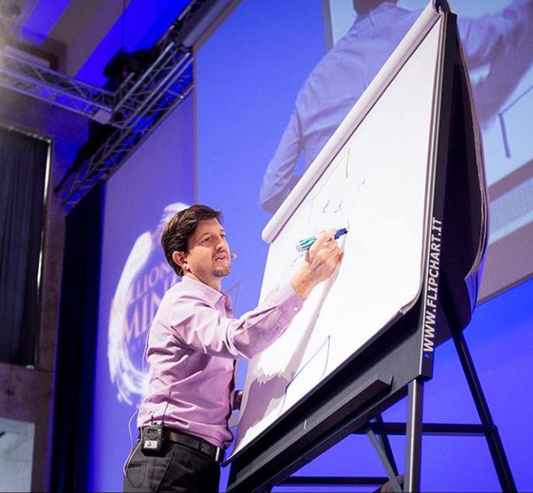
Marcus de Maria using KING Flipchart on stage

Ultimi articoli dal Blog

Alex Hormozi using a KING Flipchart during a business training presentation

Alex Hormozi Uses KING Flipchart for Business Ideas

Grant Cardone speaking on stage beside a large KING Flipchart during a training event.

Whiteboard for Videos: Why Hormozi, Brunson and Cardone Use a Physical Board

llustrazione fumettistica di Tiziana al telefono con un ufficio americano, ispirata alla telefonata a Robbins Research International per KING Flipchart.

The Call to Tony Robbins: “Your Flipchart Paper Sucks”

Production of the giant paper pads for the huge flipchart KING
4 tips for using the flipchart in the best way

CONTACTS

[email protected]
+39 370 304 9754
+39 328 976 6697

SECURE PAYMENTS

KING Flipchart.it - secure payments

QUICK LINKS

  • FAQ
  • Terms and Conditions
  • Cookie policy
  • Privacy Policy
  • Return and refund
  • Handle the delivery
  • Secure Payment
  • Terms of Delivery
King flipchart.it

KING is the unique Flipchart expressly designed for Experts and it’s Next to the Top Ones, all over the world!
KING is exclusive: giant, foldable and portable. This is the only flipchart with the double-wide panel granting the lanscape vision.

© 2026 CENTO PER CENTO IDEA SRL
VAT: IT-10779660017 – PEC [email protected] – SDI 5RUO82D
design by Caleidoscopio Web

Manage Consent

Utilizziamo cookie per migliorare la tua esperienza sul sito. Puoi accettare, rifiutare o personalizzare le tue preferenze.

Funzionale Always active
L'archiviazione tecnica o l'accesso sono strettamente necessari al fine legittimo di consentire l'uso di un servizio specifico esplicitamente richiesto dall'abbonato o dall'utente, o al solo scopo di effettuare la trasmissione di una comunicazione su una rete di comunicazione elettronica.
Preferenze
L'archiviazione tecnica o l'accesso sono necessari per lo scopo legittimo di memorizzare le preferenze che non sono richieste dall'abbonato o dall'utente.
Statistiche
L'archiviazione tecnica o l'accesso che viene utilizzato esclusivamente per scopi statistici. L'archiviazione tecnica o l'accesso che viene utilizzato esclusivamente per scopi statistici anonimi. Senza un mandato di comparizione, una conformità volontaria da parte del vostro Fornitore di Servizi Internet, o ulteriori registrazioni da parte di terzi, le informazioni memorizzate o recuperate per questo scopo da sole non possono di solito essere utilizzate per l'identificazione.
Marketing
L'archiviazione tecnica o l'accesso sono necessari per creare profili di utenti per inviare pubblicità, o per tracciare l'utente su un sito web o su diversi siti web per scopi di marketing simili.
  • Manage options
  • Manage services
  • Manage {vendor_count} vendors
  • Read more about these purposes
View preferences
  • {title}
  • {title}
  • {title}

Accessibility

Accessibility modes

Epilepsy Safe Mode
Dampens color and removes blinks
This mode enables people with epilepsy to use the website safely by eliminating the risk of seizures that result from flashing or blinking animations and risky color combinations.
Visually Impaired Mode
Improves website's visuals
This mode adjusts the website for the convenience of users with visual impairments such as Degrading Eyesight, Tunnel Vision, Cataract, Glaucoma, and others.
Cognitive Disability Mode
Helps to focus on specific content
This mode provides different assistive options to help users with cognitive impairments such as Dyslexia, Autism, CVA, and others, to focus on the essential elements of the website more easily.
ADHD Friendly Mode
Reduces distractions and improve focus
This mode helps users with ADHD and Neurodevelopmental disorders to read, browse, and focus on the main website elements more easily while significantly reducing distractions.
Blindness Mode
Allows using the site with your screen-reader
This mode configures the website to be compatible with screen-readers such as JAWS, NVDA, VoiceOver, and TalkBack. A screen-reader is software for blind users that is installed on a computer and smartphone, and websites must be compatible with it.

Online Dictionary

    Readable Experience

    Content Scaling
    Default
    Text Magnifier
    Readable Font
    Dyslexia Friendly
    Highlight Titles
    Highlight Links
    Font Sizing
    Default
    Line Height
    Default
    Letter Spacing
    Default
    Left Aligned
    Center Aligned
    Right Aligned

    Visually Pleasing Experience

    Dark Contrast
    Light Contrast
    Monochrome
    High Contrast
    High Saturation
    Low Saturation
    Adjust Text Colors
    Adjust Title Colors
    Adjust Background Colors

    Easy Orientation

    Mute Sounds
    Hide Images
    Virtual Keyboard
    Reading Guide
    Stop Animations
    Reading Mask
    Highlight Hover
    Highlight Focus
    Big Dark Cursor
    Big Light Cursor
    Cognitive Reading
    Navigation Keys
    Voice Navigation

    KING Flipchart

    Accessibility Statement

    • www.flipchart.it
    • 4 November 2026

    Compliance status

    We firmly believe that the internet should be available and accessible to anyone, and are committed to providing a website that is accessible to the widest possible audience, regardless of circumstance and ability.

    To fulfill this, we aim to adhere as strictly as possible to the World Wide Web Consortium’s (W3C) Web Content Accessibility Guidelines 2.1 (WCAG 2.1) at the AA level. These guidelines explain how to make web content accessible to people with a wide array of disabilities. Complying with those guidelines helps us ensure that the website is accessible to all people: blind people, people with motor impairments, visual impairment, cognitive disabilities, and more.

    This website utilizes various technologies that are meant to make it as accessible as possible at all times. We utilize an accessibility interface that allows persons with specific disabilities to adjust the website’s UI (user interface) and design it to their personal needs.

    Additionally, the website utilizes an AI-based application that runs in the background and optimizes its accessibility level constantly. This application remediates the website’s HTML, adapts Its functionality and behavior for screen-readers used by the blind users, and for keyboard functions used by individuals with motor impairments.

    If you’ve found a malfunction or have ideas for improvement, we’ll be happy to hear from you. You can reach out to the website’s operators by using the following email [email protected]

    Screen-reader and keyboard navigation

    Our website implements the ARIA attributes (Accessible Rich Internet Applications) technique, alongside various different behavioral changes, to ensure blind users visiting with screen-readers are able to read, comprehend, and enjoy the website’s functions. As soon as a user with a screen-reader enters your site, they immediately receive a prompt to enter the Screen-Reader Profile so they can browse and operate your site effectively. Here’s how our website covers some of the most important screen-reader requirements, alongside console screenshots of code examples:

    1. Screen-reader optimization: we run a background process that learns the website’s components from top to bottom, to ensure ongoing compliance even when updating the website. In this process, we provide screen-readers with meaningful data using the ARIA set of attributes. For example, we provide accurate form labels; descriptions for actionable icons (social media icons, search icons, cart icons, etc.); validation guidance for form inputs; element roles such as buttons, menus, modal dialogues (popups), and others. Additionally, the background process scans all of the website’s images and provides an accurate and meaningful image-object-recognition-based description as an ALT (alternate text) tag for images that are not described. It will also extract texts that are embedded within the image, using an OCR (optical character recognition) technology. To turn on screen-reader adjustments at any time, users need only to press the Alt+1 keyboard combination. Screen-reader users also get automatic announcements to turn the Screen-reader mode on as soon as they enter the website.

      These adjustments are compatible with all popular screen readers, including JAWS and NVDA.

    2. Keyboard navigation optimization: The background process also adjusts the website’s HTML, and adds various behaviors using JavaScript code to make the website operable by the keyboard. This includes the ability to navigate the website using the Tab and Shift+Tab keys, operate dropdowns with the arrow keys, close them with Esc, trigger buttons and links using the Enter key, navigate between radio and checkbox elements using the arrow keys, and fill them in with the Spacebar or Enter key.Additionally, keyboard users will find quick-navigation and content-skip menus, available at any time by clicking Alt+1, or as the first elements of the site while navigating with the keyboard. The background process also handles triggered popups by moving the keyboard focus towards them as soon as they appear, and not allow the focus drift outside of it.

      Users can also use shortcuts such as “M” (menus), “H” (headings), “F” (forms), “B” (buttons), and “G” (graphics) to jump to specific elements.

    Disability profiles supported in our website

    • Epilepsy Safe Mode: this profile enables people with epilepsy to use the website safely by eliminating the risk of seizures that result from flashing or blinking animations and risky color combinations.
    • Visually Impaired Mode: this mode adjusts the website for the convenience of users with visual impairments such as Degrading Eyesight, Tunnel Vision, Cataract, Glaucoma, and others.
    • Cognitive Disability Mode: this mode provides different assistive options to help users with cognitive impairments such as Dyslexia, Autism, CVA, and others, to focus on the essential elements of the website more easily.
    • ADHD Friendly Mode: this mode helps users with ADHD and Neurodevelopmental disorders to read, browse, and focus on the main website elements more easily while significantly reducing distractions.
    • Blindness Mode: this mode configures the website to be compatible with screen-readers such as JAWS, NVDA, VoiceOver, and TalkBack. A screen-reader is software for blind users that is installed on a computer and smartphone, and websites must be compatible with it.
    • Keyboard Navigation Profile (Motor-Impaired): this profile enables motor-impaired persons to operate the website using the keyboard Tab, Shift+Tab, and the Enter keys. Users can also use shortcuts such as “M” (menus), “H” (headings), “F” (forms), “B” (buttons), and “G” (graphics) to jump to specific elements.

    Additional UI, design, and readability adjustments

    1. Font adjustments – users, can increase and decrease its size, change its family (type), adjust the spacing, alignment, line height, and more.
    2. Color adjustments – users can select various color contrast profiles such as light, dark, inverted, and monochrome. Additionally, users can swap color schemes of titles, texts, and backgrounds, with over 7 different coloring options.
    3. Animations – epileptic users can stop all running animations with the click of a button. Animations controlled by the interface include videos, GIFs, and CSS flashing transitions.
    4. Content highlighting – users can choose to emphasize important elements such as links and titles. They can also choose to highlight focused or hovered elements only.
    5. Audio muting – users with hearing devices may experience headaches or other issues due to automatic audio playing. This option lets users mute the entire website instantly.
    6. Cognitive disorders – we utilize a search engine that is linked to Wikipedia and Wiktionary, allowing people with cognitive disorders to decipher meanings of phrases, initials, slang, and others.
    7. Additional functions – we provide users the option to change cursor color and size, use a printing mode, enable a virtual keyboard, and many other functions.

    Browser and assistive technology compatibility

    We aim to support the widest array of browsers and assistive technologies as possible, so our users can choose the best fitting tools for them, with as few limitations as possible. Therefore, we have worked very hard to be able to support all major systems that comprise over 95% of the user market share including Google Chrome, Mozilla Firefox, Apple Safari, Opera and Microsoft Edge, JAWS and NVDA (screen readers), both for Windows and for MAC users.

    Notes, comments, and feedback

    Despite our very best efforts to allow anybody to adjust the website to their needs, there may still be pages or sections that are not fully accessible, are in the process of becoming accessible, or are lacking an adequate technological solution to make them accessible. Still, we are continually improving our accessibility, adding, updating and improving its options and features, and developing and adopting new technologies. All this is meant to reach the optimal level of accessibility, following technological advancements. For any assistance, please reach out to [email protected]